Extended Practice has been a dynamic and quite stressful module that has given me an insight into my specialism through a variety of briefs. This allowed me to determine which briefs worked well and which did not, throuh analysis and evaluation. This module allowed me to learn how to manage my time in the terms of the designs and how to organize my self and work.
Due to time planning, organizing my time ensured the projects ran smoothly especially when some of them overlapped like collaboration briefs, although there were many things out of my control that resulted in me having to think and adapt especially in terms of the collaboration work because it's hard to plan someone else's work. This taught me and I gain knowledge in planning ahead and being prepared for this kind of situations in the future. This is a skill that can be taken forward for the industry, as there will be times where I will be working on multiple collaboration and my own projects in the future.
Due to the collaboration work, I feel I need to be more aware of who I am working with, I cant rely on everyone and prepare in case, someone is unable to work as it disrupts my time management. For one of the collaborative work, I had to do more as it was planned, this resulted in disagreements and tensions because I had to put my extra time doing someone else's part of work in the last minute so, in the end, we could produce a satisfactory outcome.
This module required skills while problem solving, especially when things didn't go according to the plan. While making ceramic work, many sculptures broke due to the thickness. Also in terms of putting colours, our final collaboration deer sculpture didn't look as we wanted it to be, which resulted in having to discuss new ideas and how to produce something successful. This also included problem solving within the video brief 1, things didn't go according to my plan so I had to come up with the new idea of the video using only an audio. I feel it was very beneficial and helpful at the same moment as working in the industry, things may go wrong or not work at all and I must approach the brief in new and more effective ways to generate a successful and pleasing design.
This module has also allowed me to discover an inspiration for working with briefs related to animal's rights, creating campaigns or charities, something I have been wanting to do in the future, and allowed me to this into practice.
Overall, I am proud of the work which I have produced for Extended Practice module and I feel I have evolved as a designer and creative thinker and hopefully be able to use those gained skills while working in the industries after I finish my degree.
Monday, 21 May 2018
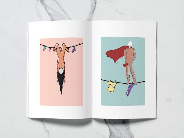
Farsya Ahmad / Zine
I have come up with the idea of creating a zine for Farsya including all her work. With the used of designed logo and pictures of her work, I managed to create a zine. It is a simplistic publication containing Farsya's the best work produced past three years. Photographs positioned sporadically thought utilising a 6x6 grid.
Farsya Ahmad / Evaluation
This brief allowed me to produce a selfbranding project for a level 6 Visual Communication student, Farsya Ahmad. I have produced Farsya's business cards, creative cv, and zine containing examples of her the best work.
This brief allowed me to get an experience while working for a client, and a very clear and helpful client which was rewarding for me as the designer. Things ran smoothly with consistent feedback and very good communication. Farsya was very pleased with her new selfbranding project. The business cards and zine will be used at the End of Year Show.
This brief allowed me to get an experience while working for a client, and a very clear and helpful client which was rewarding for me as the designer. Things ran smoothly with consistent feedback and very good communication. Farsya was very pleased with her new selfbranding project. The business cards and zine will be used at the End of Year Show.
Farsya Ahmad / CV Design
The design for Farsya's creative CV, I used information such as languages, education, skills and experience containing Farsya's logo. Farsya requested to use black pattern dots for her cv design and add a pinky feel to it.
Feedback:
Sunday, 20 May 2018
Farsya Ahmad / Business Card / Development


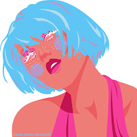
I took three illustrations of Farsya as I wanted to include it on her business card. The first illustration represents her free and open style and personality, freedom and not letting society tell you what to do. The second design was about the aspect that our brain correct images that are wrong and third illustration is her self-portrait.
I took those illustrations to the photoshop to create business cards. Farsya really like the concept of using her own illustrations within the business cards. As the illustrations are quite colourful it was necessary to use the white transparent box under the text.
As this illustration is her self-portrait using the illusion of lips, I thought it would be nice to include it in her logo design, rotating the second-word 'Farsya' other way round. As Farsya makes illustrations, photography, graphic design etc I didn't want wanted to include all of them on the business card as it would be too much and limiting herself so I used the word 'creative' as a representation of everything. As we both agreed that the idea of using the white transparent box under the text doesn't look good I decided to use only one of her illustrations. Farsya asked me to use the black one as it is her favorite one.
To make more business cards designs for Farsya to choose from I have created two more using the rest of the illustrations from her. The first one uses her self-portrait which was illustrated by someone else. Farsya had to ask for the permission of using it, it was very difficult as the person was kept asking us for the credit of her work within the business card. It was very hard to decide on the size of the text with the person who did the illustration as she wanted us to make it big and catchy on the front cover. On the end, we all came to the solution of using her name and giving her a credit on the back of the business card.
The back of the business card is simple, containing the logo, Farsya's interest, and contact details. I have made 3 versions of it as each business card contains different colour illustration. Moreover, for the first one containing Farsya's self-portrait I had to include the illustrator's name.
Farsya Ahmad / Business Card / Research
As Farsya creates lots of illustration, and she liked my idea of including her own illustration in it and she would prefer the illustration to be of her face, I have started a research about different business cards containing illustrations as a starting point.


Farsya Ahmad / Business Card / Development
Starting from a very simple and basic layout with the use of pink pastel colours as requested. The use of the brush circle symbolizes visual art, and the white background on the second design adds breathing space and creates contrasts. After a discussion with Farsya she decided not to use baby pink in her design, she like the idea of using her name twice 'Farsya Farsya' instead of including her surname.
As Farsya is from Visual Communication I thought it would be better to make the business card using her illustrations. She wanted to have something unique and different to all people. I feel my first designs are too plain and boring to represent her as a person.
Farsya Ahmad / Research / Business Card
I began to gather research on existing business cards which I felt had a similar vibe to what I would expect to be creating for Farsya. The initial thoughts I had was a minimalistic composition, keeping the attention on the information and name. As Farsya loves pastels colours I wanted to include it in the design.
Next step was typeface choices. Farsya was quite open in terms of them. As her work is quite contemporary I though about sans serif may be relevant but Farsya said she would prefer the serif font.


Next step was typeface choices. Farsya was quite open in terms of them. As her work is quite contemporary I though about sans serif may be relevant but Farsya said she would prefer the serif font.


Farsya Ahmad / Research / Client
Although given a clear direction from the client, something I have learned within my practice is to do research as it is very important. To understand Farsya as a client I must take the time to research her as a designer and a creative. As a result, the resolution should reflect her and her work as a whole.
Looking at Farsya's current work and knowing that she specializes in visual art, her branding needs to reflect this whilst also reflecting her as a person. Farsya sent me her short description and pictures of her work.
Looking at Farsya's current work and knowing that she specializes in visual art, her branding needs to reflect this whilst also reflecting her as a person. Farsya sent me her short description and pictures of her work.
Farsya Ahmad / Client Direction
Towards the start of this academic year, I wanted to create a zine since this is an area I have wanted to explore for a while. I know Farsya as we collaborated together for my first collaboration, so I was familiar with her work and style and knew she had a particular interest in visual art.
Farsya approached me and asked if there is any chance I could create a business card and cv as she is struggling with it. I suggested making a zine publication which showcases Farsya's work to make her portfolio interesting. For this aspect, I will stick to the client's direction such as colour choices/typeface (informed by business cards), but will also have quite a lot of creative freedom.
Additionally, Farsya also asked me to create business cards. I asked her for some information and direction in what she wanted these to look like and to communicate. Farsya simply explained to me that she wants pastel colours ( cyan, navy blue, burgundy, pastel pink or a combination) anything that looks nice and different. She also suggested that should would like to include her picture for a cv and for the name instead of initials she would like to have Farsya. A or just Farsya.
Farsya Ahmad / Brief
Brief
Create a set of business cards and a zine style publication for level 6 Visual Communication student Farsya Ahmad. Publication should include imagery on the construction of Farsya's final work, in preparation for a portfolio to be made for her for the End of Year Show.
Considerations
Consider what the client requests, for example colour, overall style, information (business cards). Consider the audience and match this to the client's specialism. Push the clients brand/theme in order to pull it back. Try to apply a concept, but remember what is required by the client and do not let personal taste take over from the design and direction given.
Deliverables
Business Card design
Short Publication with imagery
Saturday, 19 May 2018
LUXURY FAMILY RANGE OF CANS FOR TEAS / Final Evaluation
Final Evaluation - Collaboration with Bobonut
In conclusion, we believe our luxury tea packaging designs for the Starpack competition were successful. We decided to create packaging designs for tea as both of us personally don't drink coffee and we believe we have more knowledge about teas rather than coffee. Our first initial idea was to link our brand to the royal family because it is a British tea company, linking it with luxury we thought we will come up with a pleasing design. For the Royal name, Bobonut has created some packaging designs with the use of a gold frame and we both created different illustrations of the flavours for the tea, but after receiving a feedback we decided to create a new name and logo for our brand as people said that they saw a lot of this kind of designs for luxury teas. As it is a competition we wanted to create something different.
We decided to use a transparent tin. Since the packaging would need to support loose-leaf tea, it needed to be sturdy. We also aimed for packaging that was transparent so the consumer can see the product, this creates a more honest and credible brand as there's nothing to hide. The tin has a luxury feel which will be more likely to attract these customers. Also, the brief mentioned that the tin must be upcycled, so the extra handle is giving it more life after they are finished with a product. In the future, the tin could be also used for cookies, sugar, spices. It can be also used as a plant pot, stationary for pens etc. as it is very decorative.
Our aim was to create something that is fresh but also classy, so we believe our new name which is 'Natural Infinity' represents that. Also containing a word natural in the name will give an impression of the tea being luxury as people believe that organic and natural products are luxury. For the packaging design, we used three different pattern designs, each colour of the packaging links to the name of the tea. For the green tea, there is more freshness and very good for the body, so we got a more relax and fresh pattern. For the black one, we have chosen a subtle pattern because it is as deep and black tea. However, for the white tea, it is a Persian style pattern because it is very luxury and fits the identity of white tea, with it gold colour it is more luxury. The same layout of the logo and the name of the teas makes them consistent. Also for the back of the design, we used information how to prepare the tea with small black illustrations.
For our communication, we used google drive and facebook also we were meeting up in the school very often to discuss our work and share our opinions. We faced a lot of problems during this brief due to the time as we both worked on different projects at the same time and both of us was away during the Christmas and Easter, but we tried to keep in touch using Facebook. Also in terms of printing, we booked a print slot but the new teachers were unable to make the sticker printer to cut out our designs. We had to do it by ourselves and it was very difficult.
In a conclusion, I really enjoyed working with Bobonut as we wanted to collaborate together on a packaging design, the Starpack brief was a perfect occasion for us to do it. Although we were unable to create a real tin from metal by ourselves, I am pleased with the outcome, either way, we were able to produce and work on something together.
Subscribe to:
Comments (Atom)


