As this was the last module to be briefed this year I tried to show all my skills which I have picked up and learned this year. I really enjoyed this module and I feel I have developed a lot from OUGD403 in terms of annotating, showing the development and doing experimentations with my work. Before coming to this course it was very difficult for me to show the development of my work and experimentation as well mainly because I was doing the final design straight away. This year helped me to change that. I feel I have started to blog a lot more than I did on the beginning of this course.
Overall I think I have gained a lot of skills during those briefs which I would definitely use it in next year.
I really enjoyed the Secret 7 brief as I could show 'my stale' of working and also throughout most of the briefs for this module I was able to show this through my creative practice. I am really pleased with the outcome of work. I love that I could use my own illustrations for this brief.
Licence to print money was also fun, and allowed me to finally learn how to screen print as I have not done it before. I am not pleased to say that although I did try up to date but it was a bit hard and I did brushed under the rug this brief too much. So on the end I was really behind. It was quite long process and it took a lot of time, but I have really enjoyed it as it was something new for me. During the process there was couple of mistakes from which I have learnt a lot. I really like the final design. I will definitely try screen printing in next year.
The collaborative group work wasn't my favourite brief and it was probably my weakest aspect in this module. I know that group work is important but I prefer working on my own as it is easier to please myself with my won decisions than 5 other people. I feel it was to much of us in the group. Overall I am quite pleased with the final outcome of our exhibition branding designs even if we haven't get in to the competition. This brief also gave me a lot experience with working in the group. In the next year I would definitely try to be more confident when it came to group work. As I am really quiet and shy person it wasn't helping me at all.
Speaking from Experience was my favourite brief this module as I really enjoyed. The brief gave me a lot of freedom to create something I am personally proud of. I really like that I could just sit and reflect my experience during this year. I have done this brief quite quick mainly because I had an experience of designing the book and some leaflets from previous briefs this year.
Friday, 29 April 2016
Exhibition Branding
Below is a range of different designs which Sam has created through the course of our research and progression. I believe we have made a strong progression with the designs, colour shame, layouts.


Thursday, 28 April 2016
Exhibition Branding - Presentation and feedback
We have gathered all the work together for the presentation we would do for the tutors. The work don't have to be developed but it need to communicate our concept well and show what are planning to do. Looking at other peoples designs and the stage of work we felt a bit behind as everyone of us was concentrating on deadlines but we still communicate our aim and ideas.


Our presentation wasn't really bad as tutors said it has a lot of potential but we didn't communicate it in a right way.
The tutors told us to focus more on the idea more on how we are the elite club. They wanted us to be proud of the institution and to celebrate it in order to advertise it rather than inviting people to being a part of this elite group. They also dissuaded Sam's luxury patterns as it looks like luxury packaging for the chocolate and the colour scheme witch we chose is to dark. Moreover they suggested us to focus less on alcohol advertisement as it doesn't suits the 'luxury' exhibition. Calum discussed ideas of vinyl over the windows to depict a new location for e.g Manhattan. Saimon's opinion about it was that we are giving it to much of an 'American' feel which was true. Also he commented about my way finding map. He wasn't quite sure of the dollar symbol as it was giving it again an American feel. This presentation and received feedback helped us a lot with our directions.

The Presentation was set to be completely visual examples and mockups consisting of discussion of our Bankers Club concept and our inspiration from the styles of The Hong Kong Bankers Club.
Sam was talking about luxuriousness and the use of patterning and how he has experimented with this idea and then started to incorporating colour considerations. This was through developing our different palette options and how this can then be further applied into our restriction of type and colour when initially mocking up flyers and posters, etc so we can all attempt to work more consistently. After Sam there was Katie's ideas for invitations using the bank cheques.
Katie's ideas for invitations:
After Katie there was my turn to talk about my way finding map and how it can be developed more.
Next Harrison discussed his little mockups for the social media sites and also how he plans to use the sites for their full potential also he planed sample post engaging the audience for the exhibition before it even started.
On the end were Calum and Sophie talked about of how we could organise the space and what we can include in each area of the room and how we can use vinyl on the walls to give insights into the context of the exhibition.
Our presentation wasn't really bad as tutors said it has a lot of potential but we didn't communicate it in a right way.
The tutors told us to focus more on the idea more on how we are the elite club. They wanted us to be proud of the institution and to celebrate it in order to advertise it rather than inviting people to being a part of this elite group. They also dissuaded Sam's luxury patterns as it looks like luxury packaging for the chocolate and the colour scheme witch we chose is to dark. Moreover they suggested us to focus less on alcohol advertisement as it doesn't suits the 'luxury' exhibition. Calum discussed ideas of vinyl over the windows to depict a new location for e.g Manhattan. Saimon's opinion about it was that we are giving it to much of an 'American' feel which was true. Also he commented about my way finding map. He wasn't quite sure of the dollar symbol as it was giving it again an American feel. This presentation and received feedback helped us a lot with our directions.
Way finding - initial ideas

Using our chosen colour shame I have started creating some ideas for way finding. Firstly I want to make a map which could be used on a leaflets to show how to get from different directions to the Bank House in Leeds. I have looked at the Google maps to see where about the Bank house is located in Leeds.

Using the screen shot of Google maps in Pohotoshop I have traced the lines of the all streets on the map. I think it come up quite interesting, but it still more developing. I have ask my group about the feedback on the map. They said I should make all the lines in the same size because those thinner lines makes everyone confused what it is. Also they gave me an idea to zoom out slightly the map and look for closes car parks, restaurants, parks etc


After receiving a feedback I began to edit my way finding map. I made all the lines in the same sizes and I have zoomed out the map so more locations come up. I have been experiment a bit with the background for this map as well as I thought living it on white background would be too boring.
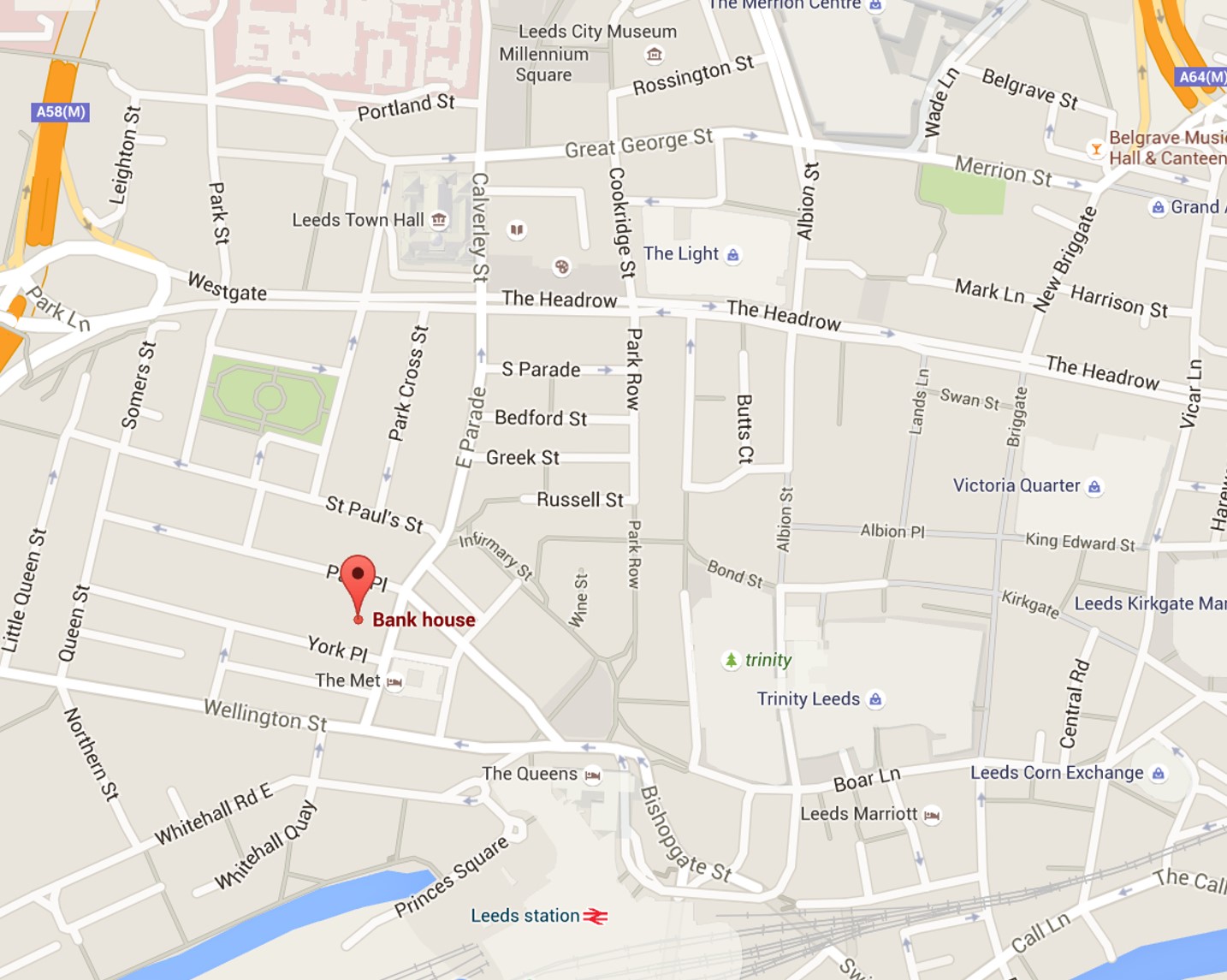


I feel that the map is a bit to empty. So I have decided to add some icons to mark all the shopping centres, parks etc are. I have also experimented with the mark for the Bank House. I have used the dollar sign mainly because it symbolise money.


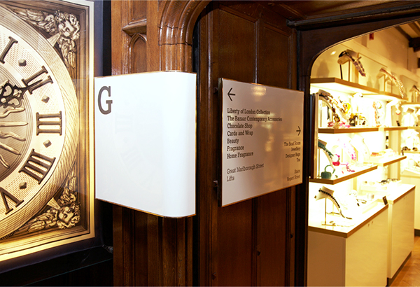
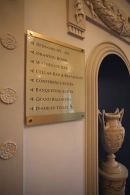
Exhibition Branding - Way finding research
My job in the group was to design a way finding. Firstly I have done a research about different way finding ideas which would suit our theme. I have look at the way finding at luxury hotels, luxury shops, museums and operas. Looking at those images below, the way finding designs are very simple, clean and neat.

Exhibition branding - Initial Colour
Before starting designing anything we wanted to chose the colours first. This will enable us all to start coming up with different ideas for the various pieces of promotional material. In the group we discussed the mood we want to portray our exclusive banking club idea. We looked at different psychological meanings of the colours:


Gold - The colour gold is the colour of success, achievement and triumph. Associated with abundance and prosperity, luxury and quality, prestige and sophistication, value and elegance, the psychology of this colour implies affluence, material wealth and extravagance.
Silver - The colour silver has a feminine energy; it is related to the moon and the ebb and flow of the tides - it is fluid, emotional, sensitive and mysterious. It is soothing, calming and purifying. From a colour psychology viewpoint, it signals a time of reflection and a change of direction as it illuminates the way forward. It helps with the cleansing and releasing of mental, physical and emotional issues and blockages as it opens new doors and lights the way to the future.
Black - The colour black relates to the hidden, the secretive and the unknown, and as a result it creates an air of mystery. It keeps things bottled up inside, hidden from the world. In colour psychology this colour gives protection from external emotional stress. It creates a barrier between itself and the outside world, providing comfort while protecting its emotions and feelings, and hiding its vulnerabilities, insecurities and lack of self confidence. Black is the absorption of all colour and the absence of light.
Gray - The colour gray is an unemotional colour. It is detached, neutral, impartial and indecisive - the fence-sitter. From a colour psychology perspective, gray is the colour of compromise - being neither black nor white, it is the transition between two non-colours. The closer gray gets to black, the more dramatic and mysterious it becomes. The closer it gets to silver or white, the more illuminating and lively it becomes.
Blue - This colour is one of trust, honesty and loyalty. It is sincere, reserved and quiet, and doesn't like to make a fuss or draw attention. It hates confrontation, and likes to do things in its own way. From a colour psychology perspective, blue is reliable and responsible.
This colour exhibits an inner security and confidence.
From the research about colour meaning which Katie carried out, gave us a bit more insight of how we can communicate certain ideas to our exhibition viewers through our colour choice. As a group we agree to stick to gold, black and white as those colours are appropriate to give luxury feel to our work. I have looked at different examples of how those colours and shades could be applied into designs.
Sam has created various colour palette which could give luxury feel into our designs. It was quite hard to decide which one to chose as I think all the colours suit well our theme.
Exhibition Branding - Visuall Research
I have researched into a broad range of current and contemporary identities for this brief- looking at visual identity, the exhibition space, display techniques and promotional material.

I really like the idea of the displaying the work. The whole wall contains only creative images without any text etc.

This one is similar to the one we are going for. You can easily say it is kind of luxury invitation or advert without even looking at the text.
I really like the idea of the displaying the work. The whole wall contains only creative images without any text etc.
This one is similar to the one we are going for. You can easily say it is kind of luxury invitation or advert without even looking at the text.
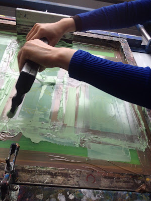
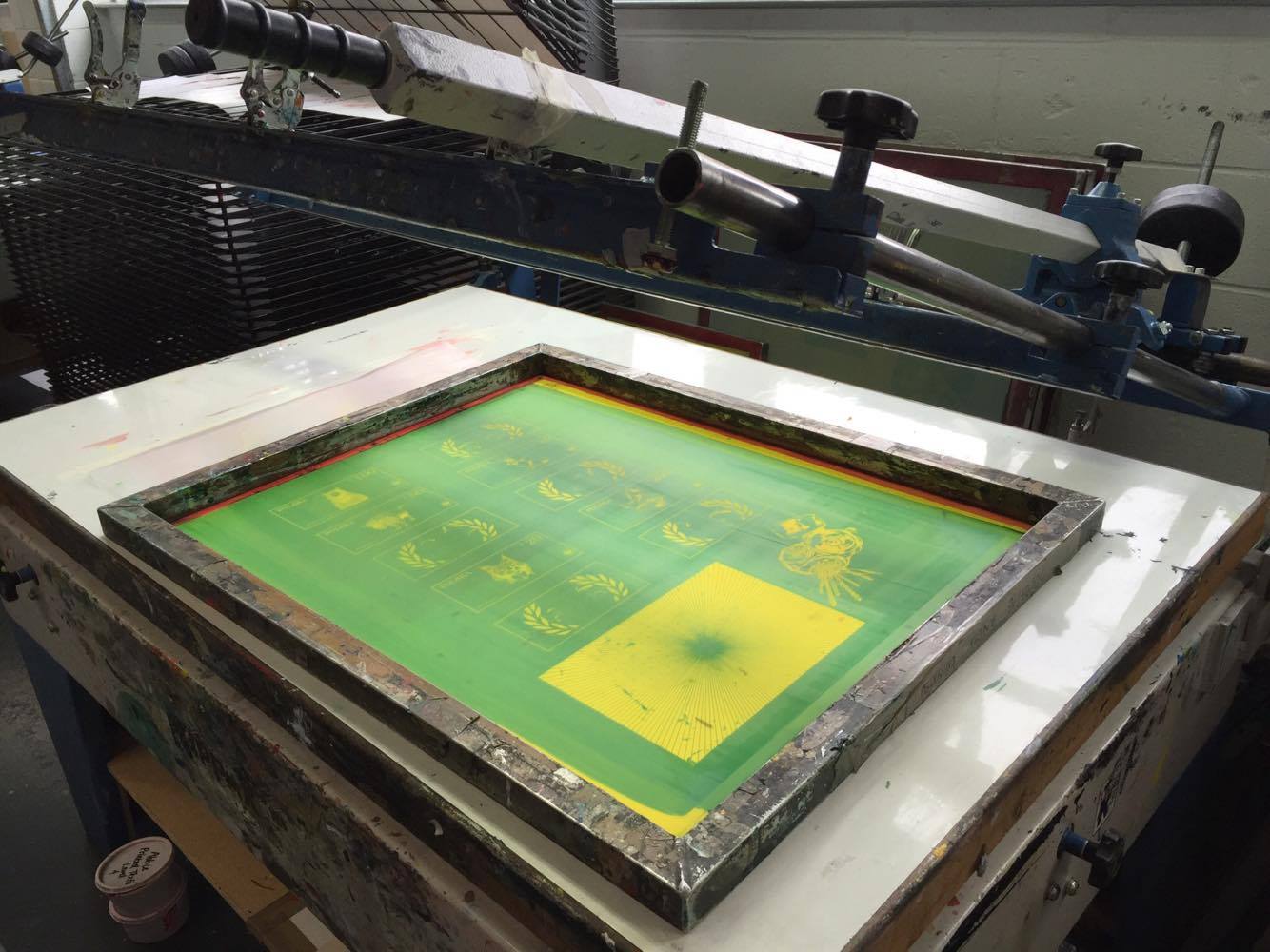
Licence to print money
Today I have been doing screen printing for money design for the first time. It was quite long process and it took a lot of time but I really enjoyed as it was something new for me. During the process there was couple of mistakes from which I have learnt a lot more. Below are photos taken during the process.


Final outcome of the screen printing:


Speaking from experience - Final spreads
Below are the final spreads for the brief 'Speaking from experience'. I really like the outcome of them as the designs seems friendly and engaging. The zinc will be printed A5 and ready to give out to everyone!


Subscribe to:
Comments (Atom)