Monday 29 February 2016

Licence to Print Money

I have decided to use Polish currency which is 'złotych'. The reason behind that is mainly because I'm from Poland, so I thought it would be nice to do something about my country. I have done a bit of research about different things which Poland is known for. 

List of things which Poland is known for:

- History 
- Monuments
- Fortress
- Variety of different Plants 
- Variety of different Animals 
- Polish Pope Jan Pawel II
- Beautiful Places 
- Polish Traditional Food 
- Lots of Legends 
- Sports Achievements 
- Singers, Poets, Book Authors, Film Directors and Actors 
- Polish language (which is the most difficult)  
- Polish Traditional Music
- Polish Traditional Dress
- Polish Traditions 
- One of the best production of Ships 
- The Best Horses 


Polish złoty

Saturday 27 February 2016

What is a book? - Bookbinding

Photography Induction 

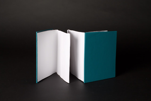
For last week Photography Induction we have been asked to photograph the books from the bookbinding induction. Also we have been given couple of objects to photograph them too. Within the photography lighting induction, we were taught the basics of how the lights, soft boxes etc. Also we have been ask to experiment with a mixture of lights, camera settings and silver/gold reflectors.

Bookbinding:


Objects: 


Friday 19 February 2016

Licence to Print Money - Brief/ Research

For the next brief this module, we have been asked to produce a design for banknotes while also exploring the cultural understanding of legal tender. This brief give us an opportunity to create our own design for the banknotes, but it limits us with ways regarding printing method. As the final resolution must be printed using analogue print process. However this will also open up new methods to the designer, that may not have been explored before, such us using more colours during screen printing.

Barbara Bernát
Link
Barbara Bernat has created a series of banknotes titled 'Hugarian Euro'. The common side of each not features European animals, the other sides shows releted species plants. She used the orginal proportions of the existing euro banknote for her design, as the domination increases, the size of the banknote is growing. The animals also represent the growth of value.


                                                           Yaka Valo
                                                               Link

Vaka Valo has designed a series of banknotes showing faces of famous of famous people with an anaglyph effect, alongside bold messy illustration over the top of the faces which obstruct them. Those banknotes don't seem to be designs of actual currency, more artistic expression.
Travis Purrington
Link

Travis Purrington's designs are subtle yet sleek, embossed with astronauts, crashing ways, ice-capped mountains and distanced galaxies. Each dollar bill contains two phrases: "This currency is upheld by the integrity of its people," and "Uires Alit," which means "strength feeds" in Latin. Purrington says that while not immediately obvious, his reinterpretations include elements from the existing bank notes such as the eagles, the US flag, and the Treasury seal. In addition, there are also key phrases from the Constitution, the Declaration of Independence, and the national anthem embedded within the notes. "I think these are very America' but in a different context than we have grown accustomed,"

Thursday 18 February 2016

What is a book? Research - Front cover

Firstly I have looked at different dream dictionary book's covers to get some ideas and inspiration from them. First of the book's which I have found is 'The illustrated dream dictionary' by Russell Grant. I really like the front cover of this book as it is containing lots of interesting and limited colours illustrations. I would love to use my own illustrations for the front cover. The illustrations are very simple yet powerful. You can tell what the book is about without reading the title. The colours perfectly suit the theme as blue, white and yellow contrast well witch each other.


As I want to include illustrations for my front cover, the other example which I have found is illustrated 'Dream Dictionary & Record Book' by Pamela Ball. The front cover contains lots of colourful line drawings. Yon can clearly say what's the book is about without reading the title because of the yellow illustrations of stars and moon. Also the blue background which symbolise the sky. 


The other example which I have found is 'The bedside dream dictionary' by Silvana Amar. Looking at  this front cover first thing which catches my eye is the word 'Dream' in large, bold font in white colour. The cover use an image of the clouds and moon. Blue and white colours perfectly suit the theme. 

Looking at those front covers I have realised that all of them are using illustrations of images of the moons, starts and clouds. Most of them uses limited colours such as blue, yellow and white. I will try to design my cover in a very simple way, using simple, yet powerful illustrations. I want to make readers know straight away what the book is about without looking at the title. Moreover I need to think of the title or slogan for my book which will catch readers attention to it.

Secret 7 - Final Ideas and Feedback

It was very difficult for me to chose one design as a final one because I think all of them are successful. Each of the design is different to the other ones. I would send them all for the Secret 7 competition.

1

2

3

4

5

6


Today's lesson we had final crit for Secret 7 brief. We have been giving feedback each other in the class. People from my class has preferred different designs.

Feedback comments

I would chose number 3 because it is beautiful, visually engaging, unusual design, in depth inspiration, and ambiguous but very intriguing'. 

' Number 3- colouring is bright yet rocky, it looks like beautiful sound is bleeding from the speakers'. 

 ' Number 3- stinking, beautiful, dramatic, strong contextual relevance. 

' Number 3- poppies are very relevant, the concept is strong'. 

' Number 2 because the design is beautiful and intricate. The use of grey background adds contrast without distracting'. 

For my final one I have chose design nr. 3 (poppies with gramophone) as I think it would be the most appropriate one. The delicate style to the illustration is personal and tells a story. The red colour highlights beautifully the poppies making them jump of the page. According to the Greek mythology there was a garden of poppies at the entrance of his place in the Underworld. Poppies also symbolized death, eternal sleep and oblivion. The hypnotic properties of poppies have long been used to treat insomnia allowing sleep to people who have trouble sleeping. 


I have submitted my work to Secret 7 competition. An email which I get back from them: 


Wednesday 17 February 2016

Secret 7 - Initial ideas

My other idea is to create an illustration of gramophone and poppies. I don't want to include the illustration of the moon because it will way to simple and probably lots of people would have it in their designs. I think gramophone would suit well to the theme and poppies would connect to the Morpheus and symbol of sleep. I have done digital version of my sketches. I would try to add and play with different effects more to make my design more interesting. I really like this illustration as it is simple and has lots of deep meaning. 


During designing an illustration with gramophone with poppies coming out of it, I have come up with an another idea of gramophone with a large poppie. I really like this idea but I think my last one was better than this one. 


Thursday 11 February 2016

Secret 7 - Interim Crit/ Initial Ideas - Secret 7

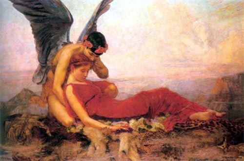
Today's lesson we had interim crit. We have been divided into small groups and asked to talk with each others about our work. I think having this crit today it was a good idea as I have found out that people who has chose the same track as me, had the same ideas of designing moon and a man playing on the piano. It made me think that my idea is to obvious and to simple. I forced my brain to think about 'dreams' in a different way. I had looked at some myths and legends about dreams. I have found a web page about Ancient Greek God (Morpheus) who is a God of dreams. Morpheus was one of the primeval gods, descended from Nyx, the dark goddess of night who was the mother of everything mysterious and anything that was inexplicable, such as death, disease, dreams, ghosts, dreams, witchcraft and enchantments. The drug Morphine which, as a side effect can cause hallucinations, was named after Morpheus. Morpheus was the eldest son of Hypnos the God of sleep and the leader of the Oneroi. The brothers were triplets and all gods of dreams. Morpheus and the Oneroi are always depicted with wings that conveyed they were gifted with magic and the power of flight. Each of the Oneiroi had a specific area of responsibility in relation to dreams and dreaming

"Dreams surely are difficult, confusing, and not everything in them is brought to pass for mankind. For fleeting dreams have two gates: one is fashioned of horn and one of ivory. Those which pass through the one of sawn ivory are deceptive, bringing tidings which come to nought, but those which issue from the one of polished horn bring true results when a mortal sees them." 


During my research I have found an interesting article about symbols of Morpheus.
The symbols of Morpheus were wings and poppies and these are often featured in depictions of the god of dreams. According to Greek mythology there was a garden of poppies at the entrance of his palace in the Underworld. Poppies symbolized death, eternal sleep and oblivion. The hypnotic properties of the poppy has long been used to treat insomnia allowing sleep to people who have trouble sleeping. This gave me an idea of using an illustration of poppies in my design for the cover. Furthermore, I should be careful as poppies are also the symbol of war. 


Using Photoshop and my sketches of the moon and poppies I have created couple of illustrations for my cover.


During the next step I have done a bit more research of different illustrations with poppies which symbolise 'sleep'. I have noticed that most of the illustrations include poppies as a symbol of 'war'.
I have looked at different colour's meaning. I think it would be a good idea to try to change the colour of poppies in my design because I don't want to make people think of war looking at my design. Also instead of using dark, bloody red colour for poppies I will try to make the  red colour bright and weathered.


Blue: symbolises trust, loyalty, wisdom, confidence, intelligence, faith, truth, and heaven. Also is considered beneficial to the mind and body. It slows human metabolism and produces a calming effect.
Purple: represents meanings of wealth, extravagance, creativity, wisdom, dignity, grandeur, devotion, peace, pride, mystery, independence, and magic.

I have changed the colours of this illustration. I think it looks more interesting. I really like this idea but I think is way to simple and childish. I would have to think of something new. 


Wednesday 3 February 2016

Secret 7 - Research/ Initial ideas

My first attempt to this brief was to research about the track which I have chose and the artist which is Max Richter. Richter plays piano, organ, synths and low-thrumming electronics; the American Contemporary Music Ensemble adds soft-hewn vocals and strings. It’s a warm, slow-moving daydream with no sharp edges and a self-consciously hazy sound, as if recorded next door or underwater. 

I have looked at different symbols of night, sleep and death together to find some inspiration, but firstly I have watched the video of the track which gave me an idea to look at different illustrations of the moon, because I have realized that the video use a lot of illustrations of it, on the beginning of the video you can see the moon phases so it gave a first idea for the design for cover. 


My first idea for the cover was to create an illustration of the moon phases as it would symbolise night and sleep (see 1st and 2nd sketch below). The illustration of the moon would be in white, bright colour and the background would be whole black to create the contrast between colours.


moon phases 1st sketch. 

moon phases 2nd sketch.

Using PhotoShop I have move my sketches forward to the digital version. I think the idea is good, but is very similar to the photos which I have seen on the internet. I would have to look for something more than this. My digital version of sketches:


Using PhotoScape to make it interesting I have added some effects to my design:


Furthermore, the video contain Max Ritcher who is playing on the piano. It gave me an idea of creating an illustration of a man playing on the piano. Firstly I have researched some illustrations on the internet looking for any inspiration:


I have also looked at Chinese Yin I Yang symbol which represents perfect balance. I have looked again at the video, which gave me an idea to use this symbol to my illustration. I have done couple of sketches with my ideas also the digital version of it as you can see below. 


In this design I have connected all aspects in a one design. I had use an illustration of the moon and piano keyboard. I really like the second design, but I think I would have to think of something else as it doesn't show the meaning of the symbol Yin Yang (perfect balance). Also looking at the first one is way too simple. Digital version: