Sunday 24 January 2016

Designing Process - Information Design - Final Design

For my final design I have decided to change the colours of my leaflet to white. Moreover I have used the illustration of the tree on every single page. In Photoshop I have change the opacity of the illustration as I believe if I would not change it would make children confused and would distract them because the leaflet wouldn't have the focal point. Children wouldn't have an idea what to look on first. I feel my leaflet is successful as it is simple, clear and suitable for the theme and target audience. The use of rebus and colouring page makes it more interesting as children would want to play with it. If I would have more time I would play with the folding more. Also instead of creating a leaflet in a from of a book I would think about creating a poster.

Final Resolution: 


To print out my leaflet I would use cheap,thin and glossy quality paper. As children would probably destroy it after using it. The format of the leaflet would be A5 which I believe would be suitable for young children. The leaflet would look like a small book, this will allow children to always have it with them. 


Designing Process - Information Design - Initial Ideas

I have designed a first page of my leaflet using the illustration which I have created of an owl.
To make the front page interesting and catch children's attention, instead of drawing the eyes of an owl I would use moving, plastic eyes which are often use for toys for children. I would have to think more about the background as I feel the illustration of an owl on a yellow background is not legible. The owl should the focus point of the front page.Moreover I have named an owl ‘Safety Owly’ as I feel it is suitable to the theme. Aso children would recognise it very quickly as the name is very simple.


For the second page I have decided to use one idea from my sketches, to make the illustration of an owl sitting on the tree. Using the speak clouds I have created couple of important sentences which are simple, clear and children would easily remember it.   


For the third page, I have decided to create a page with the most important facts and explanations for children. To make the page interesting I have used the illustration of an owl. I would need to think more about the background as it seems empty. 


For the fourth page I have used an illustration of an owl from my sketches. I have put the information where children can get help from and some safety tips for them to remember. 


As the children getting bored very quickly, for the fifth page I decided to create an illustration for the whole page to communicate the message in a different way than the other pages has. I have created a short comic suitable to the theme showing children what they can do in dangerous situation and how the should behaviour. 


To make the leaflet interesting and encourage children to look at it, at the end of the leaflet I have created a short rebus. The final resolution of it is 'I am safe' which relates to my leaflet. 


For the back of my leaflet instead of leaving it blank I have decided to create a page full of illustrations of an owl. I think it made the page look interesting. 


Designing Process - Information Design - Initial Ideas

Taking the inspiration from different illustrations from the internet I have created
couple of sketches. During this step I wasn’t quite sure which one to choose because I think
all the illustrations are sucessful as they has cartoon look which  it suitable for young children.
My next step would be to put them into the Photoshop to edit the outlines, make them straight
and improve my illustrations by colouring them with bright colours which would interest
young children. I have also played a bit with a technique of designing the leaflet. Insted
of drawing it I thought about creating an illustration of an owl with different founded objects
from the newspaper (3rd image).


Using the Photoshop I have resreated my illustrations of an owl. I have used bright colours 
which would catch young children’s attention. I was playing a lot with different colours, 
bacause I wasn’t quite sure which of them would be the most suitable one. I think all of them 
are sucessful, aiming to what I wanted to achieve. I really like the last three designs especially 
the two illustrations of an owls, one in yellow and blue colour and the second one in purple 
and green colour. 


Wednesday 20 January 2016

Designing Process - Information Design (Initial Ideas)

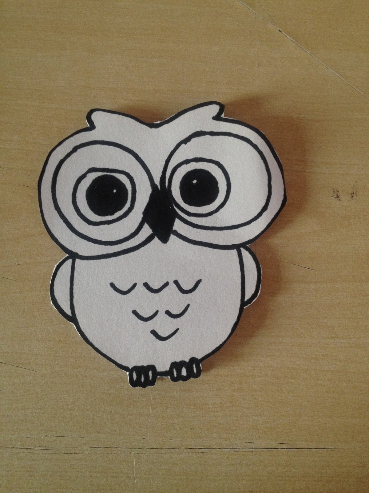
Following on form the idea of using animal's characters in my leaflet, I have decided to create an cartoon and colourful illustration of an owl. I thought of a few ways of designing my leaflet. I have done couple of sketches:

My first initial idea contains an illustration of an owl on the front page of my leaflet. An owl would hold a leaflet, so children could open it. The second idea is of an own with a life buoy. The use of a life buoy suggest 'safety', but I think the use of it would be successful while doing a leaflet about water dangerous for children. Moreover, I have made couple of simple bullet points for children. Next to it I have created an illustration of an owl sitting on the bunch of tree, next to her you can see speech clouds where I will put my short sentences how to be safe. Under it I thought about creating an illustration of a stranger trying to encourage a little child to follow him. The inspiration for those design I took from the leaflets which I have found for my research. 


My next sketches shows an owl under the umbrella which I thought the umbrella may suggest 'safety'. The second image shows an owl with question mark next it. I have used an owl in my designing as those animal symbolise the protection and smartness. Also the use of animal's character will catch little children's attention. 


Leaflet Folding 

- The size of the leaflet would be A5 format because its aiming for little children aged 6-10. 
- The quality of the paper would be very thin and cheap as children would probably destroy the leaflet after using it. 
- I would use soft, shiny paper to make the colours bright. 


My first idea for leaflet folding is to make a leaflet in a shape of an owl with 2 pages only. 
The would be small A5 format. On the front page I will create a colourful illustration of an owl. Inside the leaflet I would put some illustrations with short sentences to warn children about danger. 


I have played with different designs of folding because I wasn't quite sure which of them 
would be the best one to do. As I wanted to create a small leaflet looking like a booklet 
containing 6 pages I have looked at creating the leaflet with lots of pages. I will use the 
last idea of creating a leaflet in a form of small book as I believe is the most appropriate one
to use. I havn't chose the first idea as it is limiting me to the number of the pages. Also using 
the first idea, pages should be very squeezed. 

First idea: 


Second idea: 


Design Process - Information Design (Research)

Strangers

Based upon the study task 3, where I analysed the public information video about Charley - Strangers, this brief expands from that by setting the task of creating a information leaflet about your chosen video.

Examples of leaflets for kids which I have found: 


All children's leaflets are using only kid's or animal's characters. They are full of colours using simple and short sentences.  

Public Information Video/Research

Watch one of the listed public information films listed and identify and analyse the following aspects:

- Message

- Key facts

- Tone of voice

- Audience


The information video I chose was 'Charley- Strangers' the link to the video: http://www.nationalarchives.gov.uk/films/1964to1979/filmpage_strangers.htm


The video is based on a children's animation with a ginger cat named Charley warning children about strangers and dangerous. In this video Charley is playing with a little boy on the playground. Whilst they are playing some stranger man goes up to the little boy asking him if he likes puppies and trying to encourage this little boy to go with him to see puppies. As soon as they were about to go, Charley stops the little boy and quickly explain to him why he shouldn't go with someone he doesn't know. Little boy quickly responds to the stranger man that he shouldn't be going with him. After a while the stranger walks away leaving the boy alone. After this a little boy and ginger cat Charley go up to the mum and told her what they did. The mother is pleased with them about what they have done rewarding them both. The boy gets an apple and Charley gets a fish. 

Message: 

The message of this video is to warn many young children to not to talk or accept any gifts from strangers. This is to prevent children begin kidnapped


Key facts

In 1973 there was loots of animations based on the ginger cat named 'Charley' on the TV. He warned children about all dangerous they can face.

Charley was also given a series in 2005 when it was voted 95th on the Channel 4 TV special 100 Greatest Cartoons.  


Tone of voice: 

The tone of voice in this video is very child friendly. Due to having the voice of child and cat in the video it creates a relationship between children and the little boy from the video. 

Audience: 

The target audience for this video is for young children. Using the cartoon look and characters such as little boy and talking cat it catch little children's attention.

In prove of this I have asked my 2 little cousins (aged 10 and 4) about this video. After watching it they immediately understood the purpose of this video. I have asked them couple of questions about this video such as: What do you think the video is about and what message they trying to communicate? Why they used cartoon style? Why they used characters such us little boy and cat? After watching this video would you ever go anywhere with strangers? 

- It tells children to never go anywhere with strangers are they may be dangerous. 
- The cartoon style attacks children more. 
- The use of characters such us little boy and cat makes children want to listen what they are saying and is more friendly. 
- After watching this video they will never go anywhere with strangers, this shows that the video and all aspects which have been used are successful. 

The brief 1 - Wayfinding

The place which I chose to improve is Leeds College of Art. The main reason wanting to redesign the signage in this place is because certain aspects I feel could be improved to a point of where the signs are much clear and legible to students/teachers and visitors by also the signages are limited. As you can see on the photo of original signage which I posted below there is a third floor which is included; however it is irrelevant as access is not allowed by students or teachers. Also there is lots of different numbers of the rooms included, which I think it is unnecessary to have them as it is making people confused because some of them are not in the right positions. Currently the signage is almost impossible to read form a reasonable distance. This shouldn't be the case with way finding, it should be legible and easy to read from the distance.


Instead of using one colour, I have chose three colours which I am going to use. I thought that a small, square of colour within the sign would work better. Also I will use black colour for text because it will contrast well to the colourful background. I have created  three columns, where I am going to put all the informations (blue- courses, green- amenities and yellow- facilities).


My standard signing font which is only used in desings is  ‘Century Gothic Bold’. 
In the sense of a navigational system a sans-serif font is more appropriate to use at a larger  
and smaller scale which makes the text legible and readable from the distance.  


The black, bold type in capital letters on colourful background creates a very clear contrast, allowing readers to read the text quickly without having to stop and stare at the signage. Increasing the font weight of the text means that it also contrasts more, increasing it's overall legibility from a distance. I wanted bold, high contrasting signs pictograms to ensure full visibility from any angle and within a reasonable distance.


Example of ground floor             

Looking at my sketches I really liked the idea of creating a wayfinding system in a form of stairs because it makes the design legible, easy to read and it well represents every single floor. Three different colours separate and makes the information easy and quickly to read without making people to stop and stare at it to find their direction. They can easily just find the colour of thing they looking for without reading all the information. Having a discussion with people about my work it gave me an idea of creating a map legend. 


 I wanted to make my design much more interesting and use my imagination to create something creative as LCA is a school with creative subjects and people. Firstly I have done couple of sketches with different designs which I am considering to use. 


Using my sketches I have created a digital version of my sketches using my three colours (blue, green and yellow) I think it makes it look more interesting and creative. 


Using the photos which I have done in LCA I have edited them and used my designs which I have created to show the way the walls would look. I think those designs are successful and shows what I wanted to achieve at the beginning.  I think the design is suitable for the artistic school. The colours are bright and warm and works well together. Asking friends, class mates and other people about design, they were very optimistic saying that the design would be easier for them to use my navigation system as it is very simple, friendly and welcoming.