For our next task, we have been asked to chose one Olympics sport and design a symbol for it. I the symbol which I am going to design will be for Snowboarding. Firstly I have looked at different original Olympics symbols.

Sochi Winter Olympics 2014

Beijing Olympics 2008

Rio Olympics 2016


Looking at different Olympics symbols and taking the inspirations from them I have created my first symbol. I don't really like it because it looks very similar to them.

As I wanted to do something different, I have sketched couple of ideas to chose one of my favourite one. I really liked them all so it was difficult to chose one of them.

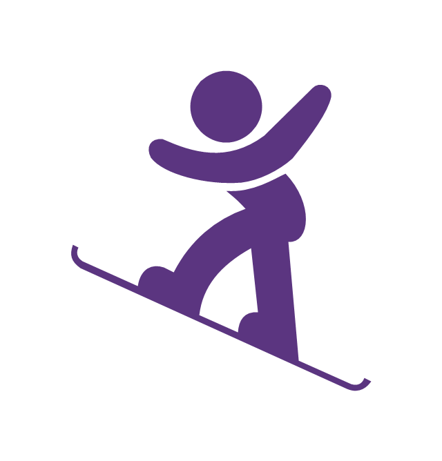
Using the Photoshop and grid and I was playing with different designs. I really like this design as I think it represents well the snowboarding and is different to the original ones. I haven't seen this kind of symbol for Olympics games before.


I have chose this one as my final one because this design represents well the snowboarding. Looking at first one it looked a bit empty for me, this is why I have added the white board under the black one. The symbol would only work well on a big scale as the small scale would make the little dots on the black board disappear. I have used only black and white colours as it makes the image look professional and legible. I hope I have considered every aspect of winter in this design.
My next step was to play with the background to make the symbol look more interesting. For my first one I have choose the blue colour as it represent winter and cold. Furthermore, the white colour may represent the winter as well and it makes the logo legible more.

My final design:
No comments:
Post a Comment