Today's lecture in the afternoon we have been looking at 'Grid', 'Legibility', 'Readability', 'Type Size/ Contrast' and 'Orphans & Windows', 'Alignment'.
Grid
'The grid represents the basic structure of our graphic design, it helps to organise the content, it provides consistency, it gives and orderly look and it projects a level of intellectual elegance that we like to express' - Vignelli, 2010
'For the design of a book the grid provides again structure and continuity from cover to cover'- Vignelli 2010

Legibility
The quality of being clear enough to read.
'Legibility is not communication, but in order to communicate type has to be legible'- (Spikermann, 1995)
FASSETT'S THEOREM OF LEGIBLE LINE LENGTH
'Line length that contain 45 to 65 characters (characters include letters, numerals, punctuation and space) are legible. Line lengths exceeding these limits challenge legibility.
'Line length that contain 45 to 65 characters (characters include letters, numerals, punctuation and space) are legible. Line lengths exceeding these limits challenge legibility.
- Typeface /
- Serif or Sans
- x-height
Readability
The ease with which a reader can understand a written text.
The way in which words and blocks of type are arranged in a layout.
- Tracking
- Leading/ line Height
- Type size
- Contrast
- Hierarchy
Alignment
Arrangement in a straight line or in correct relative positions
- Rug
- Flush Left
- Flush Right
- Centred
- Justified

Rivers
A typographic river running down the middle of a text passage. In typography, rivers, or rivers of white, are gaps in typesetting, which appear to run through a paragraph of text.

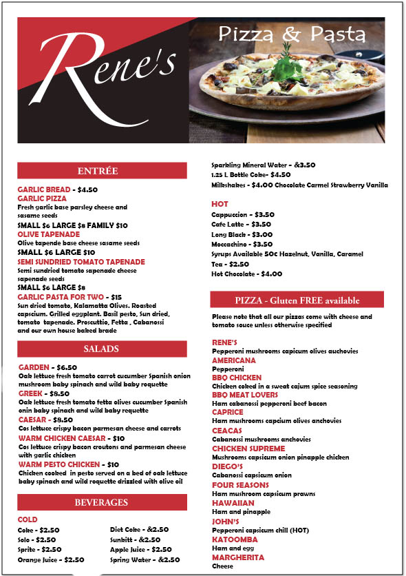
We looked at different take away menus and their layout, position of the text and fonts. We had to select a take away menu to analyse and critique. Also dreconstruct the affects type setting and layout has on the aesthetic, communication, legibility and readability of information. Choosing one take away menu we have to re-typeset the content to demonstrate our understanding of readability, legibility, information and editorial design.
The company's menu which I chosen is 'Rene's'. Which is picture below:

I have recreated a menu for Rene's. I have change the type face for it to Berlin Sans FB Demi so it makes the text readable and legible. I have slightly change the size of the text to fit all the information and images. My re-created one is below:
No comments:
Post a Comment