Tuesday 27 October 2015

Designing a book cover - Agatha Christie

Yesterday lesson we were looking at different book covers by Agatha Christie. Everyone in the class was given different type of book which we had to design a book cover for it. Our final ideas should be sent to the official webpage 'theguardian' (http://www.theguardian.com/books/2015/sep/17/drawing-the-detectives-share-your-agatha-christie-book-cover-designs). The name of the book which I get to design cover for is 'Dumb Witness'.

During this session I have created two different book covers for 'Dumb Witness':
I really like the second one with the silhouette of standing man and his shadow, but I will have to develop it more as I think is not as much interesting as I wanted it to be. I am not sure about the position of the shadow also the white background is to empty.


I have put my designed book covers for Agatha Christie to the official The Guardian web page. Screen shots of it: 


Studio Brief 01 - Logotype

On Friday's lesson we have been given a new brief to produce a series of logotypes for a rebrand of my chosen company. Using only tape we have to experiment with scale, stroke, spacing, contrast and alignment to interpret our companies. I was researching a lot of companies and looking on their logos which I would like to change also was looking for some of the companies which files for bankruptcy or are not sucesfull. I will consider those companies to rebrand:

- American Apparel
- H&M
- Primark
- Mexx
- Quiksilver
- Gap
- Coffee Republic

Couple of pictures which i took:


The brand which I choose to re brand is 'Coffee Republic'. I have choose it as I think their logo is not successful and looking on it you can't clearly say what the brand is about, mainly because of the little hearth on the end of the text which makes people confused.   I will try to give it more 'Retro' and 'Vintage' look aiming to 18 - 40 aged audience that looks for something alternative.

I did a research about well known international companies and their logos which everyone from us could recognize them even coming from different countries. The companies which grabbed my attention are 'Starbucks', 'Costa', 'Apple', 'Ikea', 'Coca - Cola, 'Nike'. Their logo's are quite simple but very brave and unique at the same time and has been many years with those companies. I will try to give my logo a successful and recognisable look which would grab people attention and stick to the costumers minds.


Orginal Starbucks logo


Orginal Coca - Cola logo


- First of all I was looking at different font styles. I wanted to choose the most appropriate one to the target audience and theme. The one which I chose for my final logo is 'Birds of paradise' as I believe is the most appropriate and has 'Retro' and 'Vintage' look.

- On the start I have sketched numerous of different ideas from the pictures I have found on the internet which really inspired me. I really like the ones in the circles, with the text around it or without it.


- After choosing appropriate font I have tried to create my first logo from the sketches which I did in my sketchbook. I really like this logo as it is simple but different type face of 'coffee' and image of little coffee beans makes the it look interesting.


- In my second step I took my logo a bit further adding a symbol of a coffee cup and smoke going out the cup. Also as I said on the beginning I was looking more on the logos in the circle with the text around it or without it.  I was also playing with different colours to find the most appropriate one. I think their are successful but if I would like to go with this idea as my final, I would have to change it a bit because the lines are too thin. On the small scale the logo wouldn't work and it would not be clearly seen from the distance. 


- As my last idea wasn't as much successful as I want it to be, I tried to push it further. I have made the lines and text bold as I think this improved my logo. It's clear and it can be used in different scales (small one and big ones). Also it has vintage and retro look which I was aiming to. 


- Using this kind of idea I tried to stick to their symbol from original logo which is 'heart'. I think it looks interesting, it has also retro and vintage look, but I think is still not eye catching and successful as I want it to be.  


- Looking at different symbols of coffee shops I found an idea of 'Rosetta art coffee'. I tired to play with different colours to chose the most appropriate one. Looking at them I still really like the white logo on back background I think those colours makes it unique. I like the one with black logo on white background as well but I think it looks very simple and similar to the logos of different brands. 


- Speaking with people and my teachers from the course, it gave an idea to try create a logo only with the text without the shapes around it. I really like this logo as I think this one is the most successful one. I have used it as my final one. 


- Using my final logo I have designed coffee cups and edited original 'Coffee Republic' web page.


On final day of our project for re branding chosen brand we have been giving feedback each other in the class. I get lots of positive feedback on my logo also I get couple of suggestions what could I change if we would have more time to develop it.

What some of the people think I should change:

- 'Space between R and C need closing'.
- 'Space between R and epublic need closing'.
- 'Logo (with Rosetta art) looks better'.


Kerndown

Todays's morning lecture was about Kerning. I found it really interesting and useful because I will use it while making a new logo for my chosen brand. 

                                                                              Kerning
Common problematic glyphs when kerning include; V, W and Y in both uppercase and lowercase. Unsightly gaps between glyphs also commonly occur between numerals and punctuation.

Kerning is to add or remove space between pairs of glyphs.

                                                   Optical metric and manual kerning
Metric kerning uses kern pairs, which are included with most fonts. Kern pairs contain information about the spacing of specific pairs of letters. Some of these are: LA, P, TO, TR, TA, TU, TE, TY, Wa, WA, We, WO, YA and YO. 

Optical kerning adjusts the spacing between adjacent characters based on their shapes. 


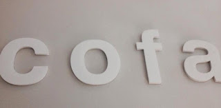
Each of the group has been given 5 random letters. We had to position them in 3 different ways to create a brand name and choose three different types of shops for which our name would be used. We have been given letters such as: K, c, a, f, o. 

Our ideas of the names:
  • facko
  • cofa 
  • foca
  • Kafoc

For our final brand name we chose Cofa.


3 types of companies: 
  • furniture shop 
  • coffee shop 
  • name of the cream (body cream) 
After that, using our letters we had to create couple of brand names for different types of companies. The type of companies were: 

- condom company(fack) 
- luxury car manufacture (fao)
- children's animations (aoc)
- pastry (kafo)
- student's night club (kaco)
- Quentin Tarantino (foca)

condom company


luxury car manufacture


children's animations


pastry company 


student's night club


Quentin Tarantino new film 

Sunday 11 October 2015

Yorkshire Sculpture Park

Today we went to the Yorkshire Sculpture park to take photos for our new project. We have to design a 5 different symbol for that place. I found it really interesting as this will help me to develop my project and to design appropriate symbol for this place. We found numerous of curious sculptures. The one which really sticked to my mind was colourful octopus and the bridge with typography on it. The sculptures were contrasting well to the background of the trees in magical autumn’s colours. 

Bon and Roberta Smith: Art por all at Yorkshire Sculpture Park  


                                                                              Niki de Saint Phalle at Yorkshire Sculpture Park
Jonathan Borofsky at Yorkshire Sculpture Park  

'ha-ha Bridge' by Brian Fell at Yorkshire Sculpture Park  

'Trees’ by Dennis Openheim at Yorkshire Sculpture Park  

Marialuisa Tadei - Octopus at Yorkshire Sculpture Park


After visiting Yorkshire Sculpture Park  everyone has to create a symbol for this place. I started with creating a simple symbol for it with only text but I thought it would not be enough for this project so I decided to create an abstract tree which reminds of a sculpture and park at the same time. If I would have more time to spend on this project I would create an animation of growing abstract tree which would change the colour of it leaves every single season. It would would be used as a welcoming video for tourists in the park.


First Ideas


Final ideas 


Friday 9 October 2015

Study Task- Collaborative Branding

In this week we have been asked to explore the semiotics of typeface design and specifically logos in corporate branding. The teacher selected a company for my group, which was named ‘Global’ auto care. Working with distinct letterforms we had to repurpose a typeface to appropriately represent our given brand. First of all we gather all the important information and created a mind map. This helped us to understand what the company is about and what products/services they are offering.


From the six fonts we chose to use a font without a serif because the original ‘Global’ logo doesn’t feature it.  The Sans Serif font makes the logo appear more contemporary and modern rather than a font with Serif such us Times Roman which has connotations of being used as a text type and it is generally related to newspapers. For our final design we chose Futura font because shapes of the 
letterforms are more rounded and curved so it represent the global shape.


Moreover, we looked at different colours and their meanings because we wanted to choose the colours that emulate the objects of the company. We chose blue, green, white and black.


- Blue colour represents professionalism, loyalty, reliability, trust, depth, stability, and conservatism. This works accordance with the aims and objects of the company. Moreover we thought about making one part of the logo blue because it made the image more prominent and interesting with two tones. We wanted to add meaning to it but maintain professionalism. 
- Green colour symbolise growth within out logo it depicts the hard working nature of the company on that they have expanded throughout the years. The company has been only based in Leeds but now has developed throughout the whole UK.
- Black colour is clean, classic, and elegant. We used mainly because it’s sleek and is not too harsh and bold against the white.
- White colour is visually easy to read and clean looking making the logo look professional.

Then, we were trying to create an illustration with the letterforms to create an image symbolising auto care services. At first we were trying to create a logo that looked like a warehouse/garage over the company name to express that it was referring to auto care.  Also we were playing a lot with the position of the letters to find the best way we can put them. Then we decided to make the logo more professional and simple by adding a pin instead of illustrating the entire logo.


We decided to use this logo, as our final one as we thought is the most successful one. The intension behind the pin illustration is to show that the company works everywhere you need them.  The glob symbolise that they work with people’s needs to ensure that the service can be easily accessible.
Moreover they provide cars from global manufactures but they stay within the UK to work.


Instead of powerpoint presentation we collected all the slides together creating one creative image.


Other team's comments about our project: