Thursday 22 December 2016

Type in context - Stock

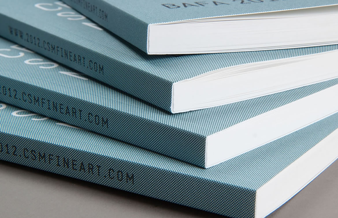
At first I wanted to create a photo book with hard cover case and with glossy paper, which might be put in the libraries,  however due to the restrictions regarding deadlines for this brief, this would be unfeasible as it would take time to send away for the files to be printed and then sent onto a binding company. I emailed couple of stores online, they told me that production time is 4 to 5 day plus 2 or more day for delivery depends what kind of delivery I would like to get. However if I was to do this, I would be certain that the end result would be attractive and reliable, and yet costly. 

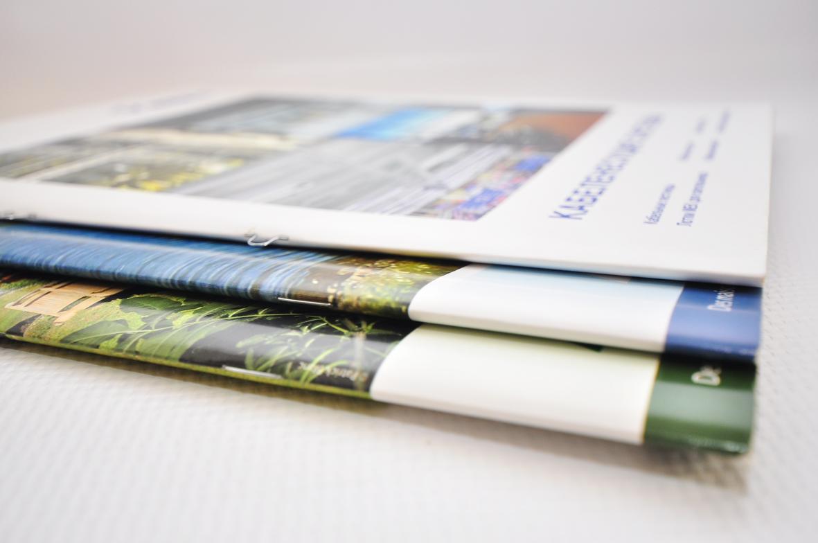
Personally I feel the staple method would be the most appropriate option because its keeping production cots lower. However I am a bit unsure if it would work because the book has a lot of pages. Especially if I would like to print it out on glossy paper. 

Also the second option is to use saddle stitch to keep my publication together but I am concerned about if the thread would not be tight the book will eventually become looser. Using Staple method would not have that risk.   


Type in context - coordinate grid

As I will make a photo book I don't want to include any text on the pages just high quality photos. After getting a feedback from friends and teachers, they suggested me an idea to write only coordinates of each place I took photo of without any description or name of the place, so if any one would be interested of the place from photo they might just type in the coordinates in google or on the map to check where is it.

Image result for map coordinates

Wednesday 21 December 2016

Type in context - Binding methods

The binding method is a crucial aspect of a publication. Fundamentally, it is what keeps it together and preserves it for as long as possible. Since we will be creating a publication of our own I thought I would dedicate time into researching the different binding methods that I could possibly try out for my own work. 

Saddle stitch

I began by looking into the simplistic nature of the saddle stitch. Though pretty basic, this binding method is functional, minimal and uncluttered. It effectively keeps your publication together and would ideally hold around 8-80 pages together as an estimate. 

Related image

Perfect bound

Perfect Binding is a widely used soft cover book binding method. With this binding method, the pages and cover are glued together at the spine with a strong yet flexible thermal glue. The other three sides of the book are then trimmed as needed to give them clean “perfect” edges.The many soft cover books that you see on the shelves at bookstores are good examples of perfect bound books. They have a square, printed spine and the cover is usually made from paper or cardstock that is heavier than the interior pages.  Plus, the cover is often clear coated to provide durability and improve appearance. In addition to authors, businesses and organizations use the perfect binding method on a variety of printing projects because of its professional appearance and relatively low cost. Perfect binding is commonly used for annual and corporate reports, manuals, catalogs, and thicker product brochures and magazines.

Image result for perfect bound

Case binding

Definition: The most common type of book binding for hardcover books is case binding. With case binding pages of the book are arranged in signatures, sewn together, and hard covers (cloth, vinyl, or leather cases) are attached.

Image result for case binding meaning

Burst binding

Burst binding is a type of Perfect Bind where the binding edge of folded sections have been 'notched' instead of pre-trimmed, creating a strong bite for the adhesive.


Stab binding

This method uses single sheets rather than signatures, meaning for this book you can use different stocks, weights and colours as each page is separate. Stab bound books have holes away from the spine, which are then bound together using string/embroidery thread. This method is relatively easy and adds an element of decoration to a publication.

Image result for stab binding meaning

Type in context - Map

As my book will include different photographs of Poland I would like to mark those places on the map where those photographs has been taken, as it would be good for those people who has never been in Poland. I have done a bit of research of the illustrated maps. As my book will include photographs it will be good to add some illustrations to it to make it more interesting. Here are some examples of the illustrated maps which I have found:

Image result for illustrated map

Image result for illustrated map

Using my research I have created illustrated maps for each of the city's Krakow and Poznan. I felt like adding a bit of illustration to the book would give it a friendly look. I have use google maps  to create them. My next step is going to add names of the places I have took photos of. Here is what I have come up with:

Poznan:


Krakow: 


I have marked all places from photographs on the map. I was struggling a bit with the second map which is for Krakow because almost everything was in the same place. Instead of writing the names of the photographed places on the map I have decided to use numbers mainly because on the Krakow's map the names will overlapping each other  making the map very hard to read. 


Using photography I have designed a page for the book: 


Monday 12 December 2016

Type in context - Cover

My book would be about Visual culture in Poland containing photos of two cities Krakow and Poznan. I have started from designing front and back cover for the publication. In order to make an informed decision I have decided to experiment with coulour/ type and layout.


Type in context - Research - Layout and Image

In order to process with this project it is essential to research vigorously into each different section of a publication. Here is couple of examples of different trends and image finishes that could be considered for my own publication.

Neon / Fluorescent colour


NICK THOMM x MERCY-MERCI at Chin Chin and Go Go Bar, Melbourne  http://www.weheart.co.uk/2014/02/12/nick-thomm-x-mercy-merci-at-chin-chin-and-go-go-bar-melbourne/:

Bright and Fluorescent coloured elements instantly capture the audience. The vivid nature of this type of ink is very contemporary and a current popular trend in design now. Only problem which designer could face is that they would have to work in RGB rather than CMYK because of the issue with printing as these colours can not be achieved via inkjet printer as they are not in CMYK spectrum of colour.

Duotone / Monotone 

Image result for duotone image pinterestImage result for monotone book cover

Monotone, duotone, tritone, guodtone is an interesting method of editing images. This is a grey scale image printed with one, two three or four ink colours. Using this method creates consistency especially in a publication with multiple images which is relevant to this current brief.

Illustration / Pattern 

  Image result for illustration book cover tumblr

Simple or more detailed illustrations or patterns can further strengthen a piece of design as there is another element for the user to look at alongside type. As seen above those simple line illustrations look yet effective and interesting.

Hyphens

Image result for hyphen poster graphic design Image result for hyphen poster graphic design

The use of hyphens is quite popular now. It means to split the words into two lines or more, sometimes used because of the filling format, sometimes for not reason at all. Using hypen is breaks up the type and creates interesting composition.

Black & White 

 Image result for black and white book graphic design tumblr Image result for black and white book graphic design tumblr

White and Black makes the page look very professional and effective. It may be the most suitable idea as it is classic, timeless and can work very well  with any colour alongside. Also black and white can create certain atmospheres for example classic and elegant or ghostly.