Monday 12 December 2016

Type in context - Research - Layout and Image

In order to process with this project it is essential to research vigorously into each different section of a publication. Here is couple of examples of different trends and image finishes that could be considered for my own publication.

Neon / Fluorescent colour


NICK THOMM x MERCY-MERCI at Chin Chin and Go Go Bar, Melbourne  http://www.weheart.co.uk/2014/02/12/nick-thomm-x-mercy-merci-at-chin-chin-and-go-go-bar-melbourne/:

Bright and Fluorescent coloured elements instantly capture the audience. The vivid nature of this type of ink is very contemporary and a current popular trend in design now. Only problem which designer could face is that they would have to work in RGB rather than CMYK because of the issue with printing as these colours can not be achieved via inkjet printer as they are not in CMYK spectrum of colour.

Duotone / Monotone 

Image result for duotone image pinterestImage result for monotone book cover

Monotone, duotone, tritone, guodtone is an interesting method of editing images. This is a grey scale image printed with one, two three or four ink colours. Using this method creates consistency especially in a publication with multiple images which is relevant to this current brief.

Illustration / Pattern 

  Image result for illustration book cover tumblr

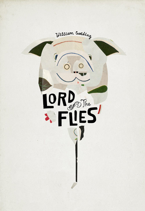
Simple or more detailed illustrations or patterns can further strengthen a piece of design as there is another element for the user to look at alongside type. As seen above those simple line illustrations look yet effective and interesting.

Hyphens

Image result for hyphen poster graphic design Image result for hyphen poster graphic design

The use of hyphens is quite popular now. It means to split the words into two lines or more, sometimes used because of the filling format, sometimes for not reason at all. Using hypen is breaks up the type and creates interesting composition.

Black & White 

 Image result for black and white book graphic design tumblr Image result for black and white book graphic design tumblr

White and Black makes the page look very professional and effective. It may be the most suitable idea as it is classic, timeless and can work very well  with any colour alongside. Also black and white can create certain atmospheres for example classic and elegant or ghostly.

No comments:

Post a Comment