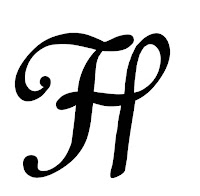
I think my outcome suit my word which is 'Coordinated' as letters are organized in Serif font. Also they are not too bold. I will have to work more on the letter 'K' as I think it has to thin line, when making the letter smaller the line is disappearing. Also I want to change the letter 'H' as I think it looks to massive and different from the other letters in the alphabet.
I have edited Badoni Typefaces. Using Photoshop I will to create my own one based on this design. Resolution:
Ideas for the name of Typeface:
Salif Rose
Soleria
Semptimela
For my final name of the typeface I am going to choose 'Soleria' as the word is not to long as the other ones, the letters look harmonized and the word suit the typeface. Creating the other two names for my font was difficult as the letter 'M' in the middle and letter 'A' on the end of the word did not want to work together with other letters.
Looking at different type designs on the interent I have noticed that some of them have their own background. I found it interesting so I decided to create my own. Examples:
Listening to the talk given by one of the student's from 6th level in our University about the way he creates a Student's Magazine in our school and showing us examples of numerous cover designs, one photograph of the future cover design really inspired me. He hang out the thermal blanket on the trees in the forest and you could see a reflection of the 'light' and sparkles on it. It looked magical. I thought it would be an curious thing, to use the idea of 'light' for my background. To create the background I decided to use aluminium foil as I think interesting background will improve the look of my typeface. I will have to edit in in Photoshop to add some effects to it. My photographs:
Using Photoshop and PhotoScape I have design a background for my typeface. I did a close up of aluminium foil changing the photography to white and black colour and added a bit of blur and Lens Flare in the middle of the background to make my typeface stand out from the it and make the letters as a focus point.
1st step Final outcome
Soleria has smooth and harmonious look that endows the typeface with remarkable delicate nature achieved through exceptional combination of boldness and subtle curves. It is an ideal resolution for making the logos, signs, displaying titles and impressing headings to look delicate and to add decorative touches.


No comments:
Post a Comment