Todays's morning lecture was about Kerning. I found it really interesting and useful because I will use it while making a new logo for my chosen brand.
Kerning
Common problematic glyphs when kerning include; V, W and Y in both uppercase and lowercase. Unsightly gaps between glyphs also commonly occur between numerals and punctuation.
Kerning is to add or remove space between pairs of glyphs.
Optical metric and manual kerning
Metric kerning uses kern pairs, which are included with most fonts. Kern pairs contain information about the spacing of specific pairs of letters. Some of these are: LA, P, TO, TR, TA, TU, TE, TY, Wa, WA, We, WO, YA and YO.
Optical kerning adjusts the spacing between adjacent characters based on their shapes.

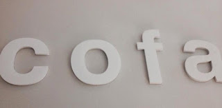
Our ideas of the names:
- facko
- cofa
- foca
- Kafoc
For our final brand name we chose Cofa.


3 types of companies:
- furniture shop
- coffee shop
- name of the cream (body cream)
After that, using our letters we had to create couple of brand names for different types of companies. The type of companies were:
- condom company(fack)
- luxury car manufacture (fao)
- children's animations (aoc)
- pastry (kafo)
- student's night club (kaco)
- Quentin Tarantino (foca)

condom company

luxury car manufacture

children's animations

pastry company

student's night club

Quentin Tarantino new film
No comments:
Post a Comment