Monday, 16 November 2015

Study task 02- Colour Relativity

- PANTONE Blue 0821 U - Blue is the colour, which I like the most and I think it work well with purple. Blue is the color of the sky and sea. It is often associated with depth and stability. It symbolises trust, loyalty, wisdom, confidence, intelligence, faith, truth, and heaven.


- PANTONE Violet 0631 U - Which I don't like.


- PANTONE Process Black U - Colour witch we all have to use - Black colour is clean, classic, and elegant.

Thursday, 12 November 2015

Typeface Design - Finished typeface

This is my complete typeface of upper case letters, numbers and designed background based on Bodoni Typeface (with a mix of Regular and Condensed Italic style).  I think that my final outcome is not successful because my typeface design doesn't represent well the word 'Coordinated' as I associate this word with formal, elegant and harmonize style, while the letters I have designed are too bold, curly, not structured and are too complicated. When the viewer looked at the each letter separately they look well, but when the letters are put together in a sentence or alphabetic order they are not matching because some of them are thicker than the others. Furthermore, despite the fact that I copied some of the curves from one letter to another and I was rotating them, they still look too different from each other. If I would have more time to spend on this project, instead of doing each letter separately and putting them together on the end I should of try to create couple of letters and put them in a word and a sentence to see how they work together.

I have been able to add my own photography as a background which I think the use of it makes the presentation of my typeface look unique, interesting and on the same time legible. I don't think my typeface could be used in a small scale as it would be not readable and will make people confused, but I think the decorative, bold, varied, elegant, extravagant typographic forms would suit a Disney/ fantasy movie, children books covers and fancy headings.


Finished typeface:

Name of the font


Final Design 


Finished Typeface


Typeface Design- Developing

From the image below you can see I have created my final ideas using Photoshop. To develop my typeface more I am going to create numbers and couple of symbols. Also I will have to chose the name of my typeface. Final resolution:


I think my outcome suit my word which is 'Coordinated' as letters are organized in Serif font. Also they are not too bold. I will have to work more on the letter 'K' as I think it has to thin line, when making the letter smaller the line is disappearing. Also I want to change the letter 'H' as I think it looks to massive and different from the other letters in the alphabet. 


I have developed my letter K and H changing the thickness of the lines. I think it improved the look of them:


Badoni :


I have edited Badoni Typefaces. Using Photoshop I will to create my own one based on this design. Resolution: 


Ideas for the name of Typeface: 


Salif Rose


Soleria


Semptimela


For my final name of the typeface I am going to choose 'Soleria' as the word is not to long as the other ones, the letters look harmonized and the word suit the typeface. Creating the other two names for my font was difficult as the letter 'M' in the middle and letter 'A' on the end of the word did not want to work together with other letters. 


Looking at different type designs on the interent I have noticed that some of them have their own background. I found it interesting so I decided to create my own. Examples: 


Listening to the talk given by one of the student's from 6th level in our University about the way he creates a Student's Magazine in our school and showing us examples of numerous cover designs, one photograph of the future cover design really inspired me. He hang out the thermal blanket on the trees in the forest and you could see a reflection of the 'light' and sparkles on it. It looked magical. I thought it would be an curious thing,  to use the idea of 'light' for my background. To create the background I decided to use aluminium foil as I think interesting background will improve the look of my typeface. I will have to edit in in Photoshop to add some effects to it. My photographs: 


Using Photoshop and PhotoScape I have design a background for my typeface. I did a close up of aluminium foil changing the photography to white and black colour and added a bit of blur and Lens Flare in the middle of the background to make my typeface stand out from the it and make the letters as a focus point.

                                                             
                                   1st step                                           Final outcome


I have wrote the manifesto for my typeface design:

Soleria has smooth and harmonious look that endows the typeface with remarkable delicate nature achieved through exceptional combination of boldness and subtle curves. It is an ideal resolution for making the logos, signs, displaying titles and impressing headings to look delicate and to add decorative touches.


Wednesday, 11 November 2015

Typeface Design Research and Initial Ideas

To get more of understanding of my word I have created a mind map with the meanings and synonyms of it. My first thoughts about this word as a typeface were about Serif font, thin and simple. On last Friday critique we have been separated into groups where we had to talk to people from our group and get their opinion about given world. 

My group agreed with me that the font should be in Serif font, very simple and thin. 
They also suggested me to try link the letters together or make them look squeezed. 


My choice of font in which I will base my typeface upon will be Serif font because Serif font is legible and widely used for body of text as it make it easier to read. With the use of serifs I can link and attach together my letters, which would make it look simple and readable even from the distance. I hope that this will well represent my given word 'Coordinated'.
I chose to base my typeface upon Badoni because is Serif font, simple, modern and each letter works very well together. 


Using Photoshop I have experimented with Badoni font. I really like the first final outcome of it as it gives an idea how I want my final font to look like. Image of final outcome: 

                                                                Design 1


Design 2


Design 3 


I have done some sketches. I have created six different designs which look at different ways of approaching the letter B, N, R, A, C, M and E. 


On the first design I wanted to add to the letters thin, readable and Serif look. I think I will use try to use it as my final resolution. Second design is of the letter 'C' and 'E' with reflection. I think it has a bit of meaning of the word 'coordinated' as every single letter is linked together. The last four designs were about experimenting with font style and thickness. I really like the third  design as the letters are thin, smooth, clear and readable. I will try to use it as my final one. 

I have sketched five different ideas for each letter from the alphabet. 


Ideas for the Name of the typeface: 

- Semptimela
- Soleria 
- Salif Regular 
- Salif Rose 

While searching for different artists, books, posters ect which could inspire me I have found couple of typefaces which their work intrigued me. First of them is Kuenstler Script which was designed in 1902 by the in-house studio at the D Stempel AG Foundry. It was originally titled Künstlerschreibschrift, which translates from German to English as "handwriting of artists". 
The second typeface which I found and is related to my project is Melany Lane. It was designed by Yellow Design Studio. The type face is a flourishy script based on traditional letter forms, but with the added quirks and warmth of hand-drawn type. I will try to use those fonts as my inspiration for my own work. 

                                                                  Kuenstler Script

                                                                             Melany Lane


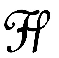
I have also looked at fonts used for tattoo design because they are using handwritten fonts and calligraphy. It gave me an inspiration for my own typeface design. Examples of work founded on the internet:



Typeface

For our second brief within this module, we have to design our own typeface based upon one of Müeller-Brockmanns classic and lead typefaces. This has to effectively communicate our given adjective, my word is Coordinated

The 9 typefaces we have to choose from are Garamond, Caslon, Baskerville, Bodoni, Clarendon, Berthold, Times, Helvetica and Univers.


Garamond

Claude Garamond was a French publisher and type designer who invented Garamond in the 16th century of which now forms the basis of many modern versions. A versatile serif font that has deep historical context, yet a contemporary and harmonious design. Legible in a number of sizes, weights and languages, it was built for the very purpose of disseminating a complex and significant range of information.


Bodoni

Giambattisa Bodoni invented ‘Bodoni’ in 1798 after being heavily influenced by John Bakersville. By 1926 a full family of fifteen font variations of Bodoni had been created a ‘transitional font’.  Its strong horizontal stress and vertical axis, when in Roman capitals which makes the text look elegant. 


Caslon

Designed by William Caslon in the early 18th century, this typeface is part of a group of serif typefaces. With short Ascenders & Descenders, this specific typeface has the purpose of fitting more characters on a page whilst at the same time leaving sufficient blank space for aesthetics and eligibility. The italic form has a rhythmic calligraphic stroke that makes it easier to read when in a body of text.


Baskerville

Designed in 1757 by John Baskerville in Birmingham, England and cut by John Handy. It is serif typeface. He increased the contrast between thick and thin strokes, making serifs sharper  and shifted the axis of rounded letters to a more vertical position. 


Clarendon 

Designed by Robert Besley in 1845. Clarendon is a strong British type created to reflect the aspects of the Victorian British Empire. The thick strokes melding into this slab serifs and fat ball terminals represent the hearty and unstoppable aspects of the British Empire.


Berthold

Berthold is a grotesque sans serif typeface which is used massively for commercial use. The font is narrow and has strokes curled up to the vertical. 


Times

Times is a Serif Monotype creation made in 1931 for the The Times news paper it was commissioned by the news paper as Stanley Morrison critised the current type saying it was badly printed and typographically antiquated. The font was developed by Victor Lardent. 


Helvetica

Designed in 1957 by Swiss graphic designer. Helvetica was created specifically to be neutral, to not give any impression or have any meaning itself. The termination of the strokes on on both horizontal and vertical lines and unusually tight letter-spacing give it a compact look.


Univers

Designed by Adrian Frutiger in 1954. Univers is a Swiss designed Sans Serif typeface. It is known for its legibility due to it being the first typeface to form a family of consistent designs. 


Wednesday, 4 November 2015

Grid/ Figure and Ground/ Cannons/ Colour Theory/ Folds/ Typesetting and Folds and what is a book?

Today's lesson we looked at Grids for the newspapers. Working in pairs we had to locate the grids used for newspaper layouts.

How important is the role of Grid in the newspaper design?

Grids for newspapers are one of the most challenging to do. This is because newspapers are frequently updated. The grid acts as a framework which contains all the important elements of the magazine, on the same time enabling designer to place the text and images into chosen spaces and right columns. Through this process designer can focus more on creating harmony, symmetry and balance. The space between columns is important as it makes the text easy to read and creates flow between all the elements.


In pairs we had to locate a grid on the The Guardian magazine. The grid of one page uses 5 columns. The grid brings order and hierarchy to the newspaper. Images and text sit easily inside the grid without distracting the reader's eye. Our work: 


Figure and Ground
The eye differentiates an object from its surrounding area. A form, silhouette, or shape is naturally perceived as figure (object), while the surrounding area is perceived as ground (background).

Figure 

The word 'Figure' above is clearly perceived as figure with the surrounding white space ground. It is usually the smaller of the elements in the visual field.


In this image, the figure and ground relationships change as the eye perceives the form of a window shade or the silhouette of a face.


This image use complex figure/ ground relationship which change upon perceiving leaves, water and tree trunk. 


Ground
Everything that is not figure is ground. As attention shifts from figure to figure the ground also shifts so that an object can go from figure to ground and back.

White Space
White space refers to the canvas/page space left in between different elements of your design but is sometimes referred to as negative space. There are two types of negative space:

Active White Space
This is the space that you make a conscious effort to add to your design for emphasis and structure. Active white space is often asymmetrical, which makes the design look more dynamic and active.

Passive White Space
This is the white space that occurs naturally, such as the area between words on a line or the space surrounding a logo or graphic element.


'Nest' is an Leeds College of Art student's Magazine. With a new magazine every couple of months come a new magazine cover and lots of new images of work produced by students in our university. 


This double black page spread is based entirely around the background image which could be considered the figure as it is the main eye catching part. This double page has a lot of a 'white' space in black colour around the design. 


Although this double page has less white space than the previous one, but it has a blocks of text on one side when on the other are just pictures. The layout of the text and images is very organised. The bold text on the top of every paragraph separates the text making the page clear and organised. Also separating the text and images avoids overcrowding the page.  


This double page contains lots of white space. There is no any text on it just images. This makes the photographs flow well together and looking organised. 
  
Next lesson we talked about Canons. For our study task in groups we had to create a mind map about Rules of Graphic Design and answer on three question such as: what are they? how do they help designers? when are they unhelpful? should we always use them?

Balance

Visual balance comes from arranging elements on the page so that no one section is heavier than the other. Or, in other instances, a designer may intentionally throw elements out of balance to create tension or certain mood.

Proximity/ Unity

In design, proximity or closeness created a bond between elements on a page. How close together or far apart elements are placed suggests a relationship (or lack of) between what are otherwise disparate part. Unity is also achieved by using a third element to connect distant parts.

Alignment

It brings order to chaos. How align type and graphic on a page sn in relation to each other can make your layout easier or more difficult to read, foster familiarity, and/ or bring excitement to  stale design.

Repetition/ Consistency

Repeating design elements and consistent use of type and graphic styles within a document shows a reader where to go and helps them navigate your designs and layout safely. Ensure that your document utilises the principles of repetition, consistency, and unity in page design.

Our created mind map:


We have been divided into small groups and asked to chose four Genres from the list below and chose a colour form the pantone colour guides which would well represent the our chose genre.

- Chick Lit 
- Crime
- Fairy Tale
- Fantasy 
- Historial Fiction 
- Horror 
- Humour
- Mystery
- Romance
- Since Fiction
- Thriller 
- Western
- Young adult

With my group we have chose 'Crime', 'Fairy Tale', 'Fantasy' and 'Horror'.

For the 'Crime' we had chose:


For the 'Fairy Tale' we had chose:


For the 'Fantasy' we had chose:


For the 'Horror' we had chose:


For the next study task we had to show couple of examples of folds and create a booklet to demonstrate skills we had learned in sessions. 

The fold which I chose is 'Hot Dog' fold which is very simple to do as can be created from any size paper. 


What is a book? 


What is the purpose of a book? 


Definitions of book:

A written or printed work consisting of pages glued or sewn together along one side and bound in covers.
- A bound set of blank sheets for writing in.
A work of fiction or non-fiction in an electronic format.

There are range of things to consider while making a book such us stock, binding method, layout, colour, typography etc. 

Book Binding: