Tuesday, 28 February 2017

Studio Brief 01 - Papyrus


As it was quite hard for me to decide which of the designs should be submitted as the final one I have asked people about their opinions and which one should be sent for the competition. It total I have received 8 responses.
Feedback 

- I prefer the first one with the moon and the sun 
- I think the second one 'mandala' is most appropriate one for adults as it has lots of details. 
- The second one is better. 
- I love the one with elephants 
- Mandala
- Sun - the fourth one :) 
- I think the fourth design with sun, as it has a lot of details 
- Sun

1st -1
2nd - 3
3rd - 1
4th -  3


The mandala and sun design won. I have decided I will send the 'sun' design for the competition.


Studio Brief 01 - Papyrus - Mandala - Initial Ideas

As the people liked the design the sun I thought I can create some design with much more details. On the top right corner I have left the empty, blank space for people to add their text what makes them relaxed.


As the previous designs were quite plane and simple I have to think about the design in which I could combine all those elements. I have decided to look at different designs for Mandala. I have found couple of them which really inspired me:


Final idea

Using the mandala idea I have combined all the elements from the previous designs. In the middle of the design I have left the blank space for the people to put the text. The design has much more details than the previous one. It seems more suitable now for the target audience. 


Studio Brief 01 - Papyrus - Initial ideas

 Nature, animals, fruits and sunny weather is calming. On the designs there is a left, blank space for a message about what makes you calm. The designs are really simple allowing people add some creativity to it, they can draw anything they want in the background or even add something extra.

Flowers - Nature 


Elephants - Animals


Pineapple - Fruits


Sun - Nice weather 


Feedback: 

- I like those designs especially with the sun and elephants, but I feel it should have more details as it is for adults.  
- Love the design with sun 
- I think you should combine them all the make one design full of details. :) 
- Sun is the best one :) 

Wednesday, 22 February 2017

Studio Brief 01 - Papyrus - Research

During my research, I have found out how similar all the adult colouring books are. They are full of different illustrations of nature, patterns with the use of the same illustrative style.

Enchanted Forest
This colouring book uses a mythical escape to help calm the mind using imagery of nature.


Alices Adventures in Wonderland
This colouring book encourages the imagination into a fantasy land full of illustrations with lots of details. Taking the person away from the real life and transferring to this full of fairy tales land.


Studio Brief 01 - Papyrus Student Brief

This brief is based on the prevention of young suicide. The purpose is to relieve stress by colouring.
They are publishing a colouring book called "The Art of a Peaceful Mind." An adult colouring book style one which is something that helps you feel calm.


There should be a space for a message about 'what makes you calm.'

The requirements are:
-3 landscape with space for your paragraph
-0.3mm pen - by hand
-3px brush - digitally
-Deadline 27th feb


What does makes me calm? 


- Mountains 
- Stars
- Sky 
- Music 
- Nature/Plants 
- Tea
- Meditation
- Sweets - Food
- Animals
- Patterns
- Drawing

I have created a short survey asking people what does makes them calm. I have gained 15 responses: 

- Playing the piano makes me calm
- Nature/ Ocean
- Silent
- Music
- Meditation
- Playing games I think :)
- Good film
- Yoga
- Food, especially some sweets
- 1 bottle of wine, 2 bottles of wine, 3 bottles of wine :)
- Good company/ friends
- Lying on my bed
- Nap
- Spa
- Hot shower

Friday, 10 February 2017

Individual Practice - Penguin Design Award - Final Design + Feedback

Final Design

I have designed the the back cover of the book using the background from the illustration. I have used a quote from the book and wrote down a description.  


I have submitted my design to the Penguin awards.


Monday, 6 February 2017

Individual Practice - Penguin Design Award - Initial Ideas

Concept one: 


This version of the front cover was inspired by patterns design. I created an illustration of the feather which was repeated through the front cover. I have experimented with two versions of it in white and black colour. In the middle of the page I have used the title and the name of the author. I have also changed the opacity of the image under the text to make is stand out more from the busy background. Overall I feel the designs are successful especially the white one as it's clear. 

Concept two:


This approach was inspired by the poster which I have found in polish language. Also I have tried to include silhouette in my design. I used the illustration of the tree for the background to make it look busy.  So far I am not feeling as this design is successful. 

Concept three:


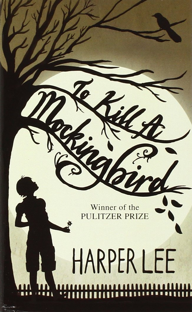
This approach was inspired by the illustration which I have annotated in my research of using typography. Also existing covers for this book include silhouette designs, so I thought it would be quite interesting to go with this idea. As the design on the white background looked too plain and boring. I have used an illustration of the tree changing the opacity of it and colour to make the background look more interesting and pleasing. 

Feedback:

- I like the first one in white, with the repetition of the feather, but I saw many people taking this kind of approach. I think you should go with the last one as it is interesting as well. 

- The last one, I really like the way you positioned the text on the bird. 

- The first one looks to classic and simple. The last one is more interesting and I feel it is more appealing to people. 

- The second concept is quite cool, but if you would like to go with this idea I think you should work more on it as the design is quite boring.

- I really the first design (white one) as the black one is to dark. But I agree with the first comment as many people has took this concept. I think the last one is successful as well but you should change the position of the first letter 'T' as it's quite hard to read. 

Individual Practice - Penguin Design Award - Research

I have started a research about similar front covers including the bird. I have found a couple of interesting designs which gave me a lot of inspiration. I have found them on Pinterest/ Tumblr and Behance.


The first three designs are an illustration based on the silhouettes. The designs are quite dark and gloomy symbolize the death. I really like the first Polish illustration as it uses quite interesting typography which suits the backgrounds. I will try to create this kind of illustrations for my final design. 


The other two designs which I have found on Behance are the pattern designs of feathers. This gave me an idea to create an illustration which the feather will be repeated through the front cover in a thin, clear and simple style similar to those designs.

Individual Practice - Penguin Design Award - Past covers

It is beneficial to explore what has already been created for the publication, in order to avoid repeating any design decisions that have previously been on shelves. To Kill a Mockingbird is a novel by Harper Lee published in 1960. It was immediately successful, winning the Pulitzer Prize, and has become a classic of modern American literature. The covers contains illustrations/ silhouettes, each of the design contains an illustration of the tree/bird/ girl. The covers are simple but successfully are delivering the message.  


Related imageImage result for to kill a mockingbird bookImage result for to kill a mockingbird book

Thursday, 2 February 2017

Individual Practice - Penguin Design Award - Briefs

1. To Kill A Mockingbird by Harper Lee

‘Shoot all the bluejays you want, if you can hit ’em, but remember it’s a sin to kill a mockingbird.’
A lawyer’s advice to his children as he defends the real mockingbird of Harper Lee’s classic novel – a black man charged with the rape of a white girl. Through the young eyes of Scout and Jem Finch, Harper Lee explores with exuberant humour the irrationality of adult attitudes to race and class in the Deep South of the 1930s. The conscience of a town steeped in prejudice, violence and hypocrisy is pricked by the stamina of one man’s struggle for justice. But the weight of history will only tolerate so much.
‘Someone rare has written this very fine novel, a writer with the liveliest sense of life and the warmest, most authentic humour. A touching book; and so funny, so likeable.’ Truman Capote
‘No one ever forgets this book’ Independent

2. In Cold Blood: A True Account of a Multiple Murder and Its Consequences by Truman Capote

In Cold Blood is regarded by many critics as the pioneering work in the true crime genre. It is a startling, true account of a gruesome crime and a skilfully researched piece of journalism – it is a literary masterpiece brilliantly imagined which reads like the most gripping of thrillers.

3. The Secret Diary of Adrian Mole Aged 13¾ by Sue Townsend    

'Saturday January 25th
10 a.m. I am ill with all the worry, too weak to write much. Nobody has noticed I haven’t eaten any breakfast.
2 p.m. . . . Perhaps when I’m famous and my diary is discovered people will understand the torment of being a 13¾-year-old undiscovered intellectual.'
Adrian Mole’s painfully honest diary is a hilarious spots-and-all glimpse into the troubled life of a teenager. First published in 1982, it quickly became a best-seller and has since been adapted for radio, television and theatre.

Individual Practice - Quorn Brief- Final Design


Please explain why you chose this brief, and how your view of the brand has changed since you began working on it.


Please give a short description of your work, and the thinking behind it.


Final Feedback:


Would this gift pack make you want to try to be meat-free for a day? Why?  

Yes, the use of the idea of 'Veggie food diary' and images of the animals are definitely great ideas which influenced me already to try to be meat-free for a day :)
Yes, would like to show the appreciation for the effort shown in this campaign. 
- Yes, the campaign is simple and friendly trying to encourage people to 'try' not to preach someone goes meat-free for a day. 
- As I am a meat lover person who would never give up on meat I feel this campaign gave me a bit to think about it especially the cards with the slogan 'meet your meat' containing cute pictures of the animals and kind of sad information how each animal is being killed. 
- Maybe, I love meat too much :) 
- Yes, the approach is very friendly and encouraging with interesting information. 

Would this gift pack influence you to try Quorn product? 

Yes: 5
Maybe: 1
No: 0

Is there anything you would change or add to the gift pack? Why? 

- No, I think there is just a right amount of content.
- Nope
- If the campaign is targeting children as well I think you should add something with would encourage them as well. Maybe animals masks? 
- No, I think it would be too much if you would add more stuff to it. 
- I really like the idea of 'Veggie Food Diary' it would be good to see maybe a small booklet with different recipes? 
- No, as someone said on the top there is a right amount of content. 

Any other feedback? 

- Good job, keep up the good work!
- Really like the idea of Veggie Food Diary. 
- Interesting and engaging approach. 
- Good work 
- Interesting. 

Wednesday, 1 February 2017

Individual Practice - Quorn Brief- Pin Badge/ Trolley token/ Organic Shopping Bag/ Stickers/ Discount Voucher

The gift pack would include extras for people such as Pin Badge, Organic shopping bag and stickers to make the campaign bigger and more effective. Wearing the bag or the pin badge by people would be grate advertisement of the event. Especially the stickers would play important role as people would stick them everywhere on the bus stops, inside the busses/trains, poles, bridges and so on...

I have started from designing a sign 'Go Meat Free Day'. I tried to use green/yellow colour which would symbolise nature, life, safety, environment, clarity, but It didn't suite the company logo. Then I tried to use orange colour from the Quorn logo which I feel is more successful. Moreover I have tried two different fonts such as 'Moon Flower Bold'- the font which I have used for all designs and 'Bebas
Neue'.


Pin Badge and Trolley Token

I have transferred all the fonts on the images of the pins to decide which one of them is the most successful one. The first two designs are the most readable ones from the distance especially the second one in orange colour. I have also created a trolley token using Quorn logo. 


Organic Cotton Bag 

Using the idea from the Pin Badge I have designed an organic cotton bag which would contain all the gifts inside and then given out to people for free. In the left hand corner I have used the logo of the 'Quorn'. 


Stickers

In side the gift pack people would receive a couple of stickers, so they can stick them everywhere they want to around the city. This will help to spread 'Go Meat Free Day' around the city/country. Stickers would be printed out in the size of  L8cm and H5/6 cm. 


Discount Voucher 

I have created three different discount vouchers which would be the part of the gift pack. The size of the vouchers would be L7cm, H7cm.